
Color is a powerful tool to use in your quilt to create emotion, movement, and impact. Here are some tips to give your quilts that extra pop!
Complementary Colors
Complementary colors are the color sets that sit opposite each other in the color wheel.
They are as follows:
- Red & Green
- Yellow & Purple
- Orange & Blue
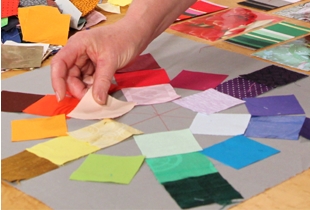
When placed together these colors create a visual burst of excitement! But not ever quilt needs such a big BOOM.
Here are some tips for adding a complementary color to your next quilting project:
- When a quilt project is predominately one color, use small amounts of its complementary color as an accent throughout the quilt.
- Create a focal point for a project using the complementary color, then frame the project with borders also using the complementary color.
- Bind the quilt in a complementary color.
- Take a subtle approach and use an accent fabric that has the complementary color in it, but is not the main background color.
- Embellish using a the complementary color.
Play with these ideas and have fun with color!
Want a crash course on color theory? Katie Pasquini Masopust offers an incredible iquilt online class or DVD that will have you playing with color.
0 Comments for “Tips to Make Your Quilt Pop”